Nearly a year ago, we released a piece noting how leading indicators flashed red for signs of a coming recession. But with the arrival of what the Wall Street Journal touted as “the most anticipated recession ever”1 still delayed, have those once-reliable indicators faltered? What may be holding the US economy back from recession despite the many signs pointing to one?
What You'll Learn
Current and historical yield curve inversions suggest that a recession, if it comes, would be “late” by historical standards.
Today’s drawdown in the Leading Economic Indicator Index is one of the largest and longest within our observation period; all comparable drawdowns and lags have culminated in a recession.
The labor market appears to remain resilient, and consequently, the often-reliable Sahm rule is not indicating a recession.
Historically, the wide dispersion of performance outcomes during hard and soft landings may give investors pause as to how to appropriately position client portfolios.
In this article, we revisit historical instances of yield curve inversions, Leading Economic Indicator Index (LEI) collapses, and the Sahm rule to gauge just how “late” this heralded recession might be—if it comes at all.
We then take a closer look at the implications of three potential scenarios now putting the economy in a precarious balance. We use history to guide us in understanding how different asset classes have performed in those macroeconomic environments and inform just how divergent performance may be depending on how well the Fed sticks the landing.
Leading Recession Indicators—Is This Time Different?
A few leading economic indicators have seemed to stand the test of time. The predictive power of yield curve inversions is well documented; they have a near-perfect record in predicting recessions since the 1960s. In fact, the only false positive was in the mid-60s.2

Footnotes
Source: Bloomberg, Yield Curve represented by Market Matrix US Sell 2 Year & Buy 10 Year Bond Yield Spread, Recession periods represented by Monthly US Recession Indicator, Yield Curve Inversion represented by negative Bond Yield Spread, as of June 2023.
Source: Bloomberg, Yield Curve represented by Market Matrix US Sell 2 Year & Buy 10 Year Bond Yield Spread, Recession periods represented by Monthly US Recession Indicator, Yield Curve Inversion represented by negative Bond Yield Spread, as of June 2023.
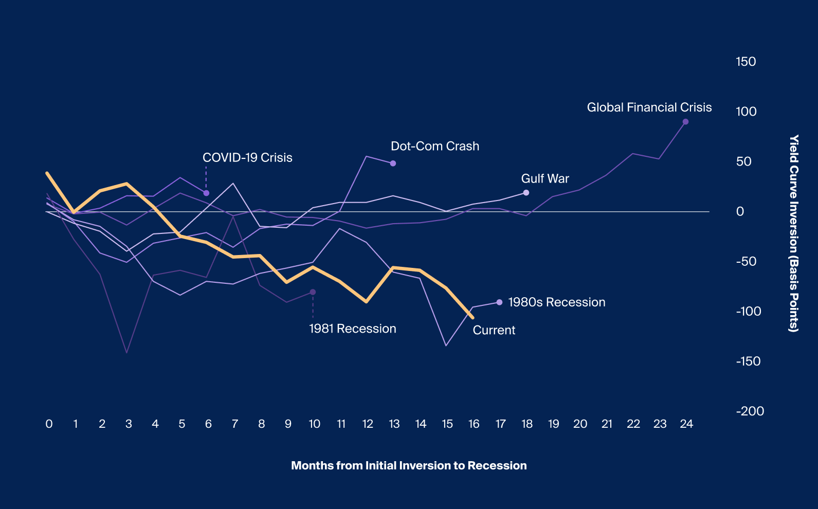
Recessions have tended to follow shortly after an initial inversion event, as measured by the yield of the two-year Treasury bonds exceeding that of ten-year Treasuries. That lag has been as short as six months and as long as two years, with an average of approximately 14.7 months (Exhibit 1).
At the time of writing, the current inversion had entered its 16th month, meaning that a recession, if it comes, will be “late” by historical standards. The degree of inversion, which reached as great as 106 basis points, has been the largest since the inversion of 1981.3 If the US does avoid a recession, it will be the first time since 1967 that a sustained inversion has not led to a recession.3
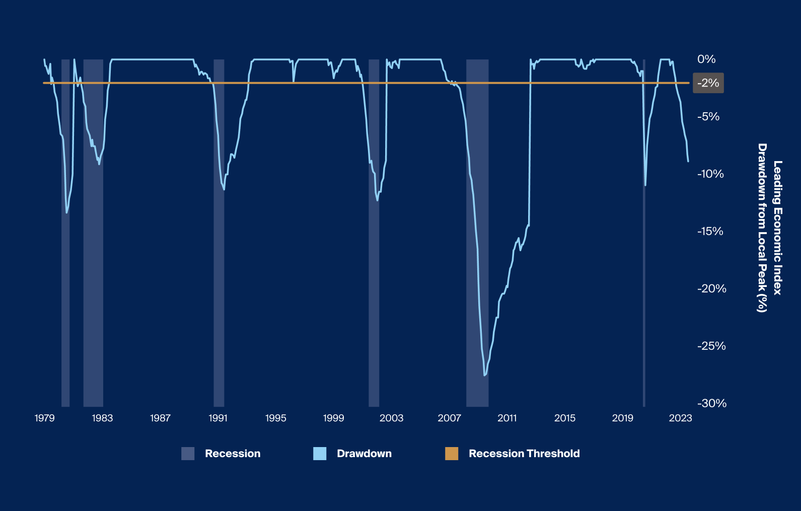
The Leading Economic Index (LEI)5 has also proven to have predictive power leading up to past recessions. Last year, as we previously highlighted, it began falling from its peak. Historically, when the LEI fell from its local peak by more than 2%, a recession followed every time since 1980, excluding the COVID-19 recession (Exhibit 2).

Source: Source: Bloomberg, Leading Economic Indicator represented by Conference Board US Leading Index, Recession periods represented by Monthly US Recession Indicator, Drawdown from Local Peak calculated by taking the cumulative return from Local Peak to the following Local Peak, Local Peak calculated on a 12-month rolling basis, as of May 2023.
Source: Bloomberg, Leading Economic Indicator represented by Conference Board US Leading Index, Recession periods represented by Monthly US Recession Indicator, Drawdown from Local Peak calculated by taking the cumulative return from Local Peak to the following Local Peak, Local Peak calculated on a 12-month rolling basis, as of May 2023.
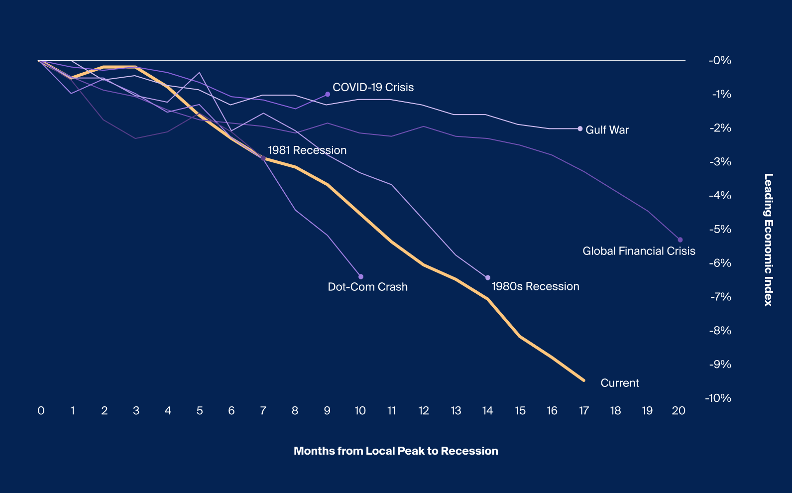
Exhibit 2 tracks each historical case, from a local peak in the LEI to the start of a recession. Recessions have lagged between seven to 20 months, or an average lag of 12.8 months, after a drawdown in the LEI (Exhibit 3). At the time of writing, 17 months after the LEI last peaked in December 2021, the index is down 9.4%—which, by historical standards, has been the greatest drawdown in LEI prior to a recession (Exhibit 3). It is also approaching the longest historical lag between a peak to a recession.

Footnotes
Source: Bloomberg, Leading Economic Indicator represented by Conference Board US Leading Index, Recession periods represented by Monthly US Recession Indicator, Drawdown from Local Peak calculated by taking the values from Local Peak to month end before a recession, Local Peak calculated on a 12-month rolling basis, as of May 2023.
Source: Bloomberg, Leading Economic Indicator represented by Conference Board US Leading Index, Recession periods represented by Monthly US Recession Indicator, Drawdown from Local Peak calculated by taking the values from Local Peak to month end before a recession, Local Peak calculated on a 12-month rolling basis, as of May 2023.
Economic Headwinds and Tailwinds—Why the Proverbial Plane Hasn’t Landed
These more historically reliable indicators for predicting recessions are indeed predicting a recession, so why hasn’t the so-called plane landed? Key factors potentially preventing us from tipping into recession are primarily associated with the strength of consumers and the labor market.
Following the pandemic, fiscal stimulus resulted in a substantial expansion of consumer savings to stimulate the economy amid an economy paralyzed by lockdowns. At its peak in 2020, accumulated excess savings reached around $2.1 trillion nominally. As of March 2023, consumers had drawn down nearly $1.6 trillion, at a rate of nearly $85 billion per month.6 With a presumed $500 billion in excess savings still in the economy, consumers still appear eager to spend and stimulate the economy.7 As such, consumer confidence rose in June to its highest level since January 2022.8
Consumer sentiment is also closely tied to the labor market, which has been a boon for the US economy over the last few quarters.9 An average of 314,000 jobs were created each month so far in 2023, and recent nonfarm payroll releases have exceeded their consensus expectations for the longest consecutive period in 25 years.10 However, cracks may be forming in the labor market through the lens of initial jobless claims. Of the slight rise in initial jobless claims, the majority comes from higher-income cohorts;11 distress among these workers could significantly affect consumer spending, especially if the trend continues into the end of the year.
While a rise in initial jobless claims and unemployment is usually a lagging indicator and a result of an economic contraction, many economists use the Sahm rule—which uses changes in unemployment—to predict recessions. The Sahm rule states that when the three-month moving average of the unemployment rate rises half a percent or more relative to its low of the previous 12 months, a recession may be imminent.12 This measure has proven to be considerably effective in determining a recession and has done so correctly for every recession in the United States since 1970.13 Due to the continued strength of the labor market despite the tightening of monetary policy, as of June, the Sahm rule recession indicator still remains below the 0.5 percentage point threshold, perhaps demonstrating the ongoing resilience of some parts of the economy.
In short, indicators that were historically reliable in predicting recessions are pointing in different directions, which only adds to the uncertainty looking forward. It’s true that certain historical indicators are flashing warning signs, but as evidenced by the Sahm indicator, the labor market (often the last pillar to fall in an economic contraction) seems to remain robust and thriving. Such uncertainty may give rise to asymmetric opportunity, and to seek to take advantage, it may be important to understand the different paths the economy may take.
Still Circling the Runway
With historically reliable leading indicators in conflict, the path of the macroeconomic environment, and thus markets, are up in the air. We revisit the airplane descent metaphor that has dominated market narratives. The three prevailing scenarios described by market participants—soft landing, hard landing, and no landing—may be characterized at their core by the path of inflation, interest rates, and economic growth. New data has swung sentiment from one scenario to another, and now more than a year after the Fed first began its record-pace rate hikes, all three scenarios are still on the table.14

Footnotes
Source: Luca Benzoni et al., "Why Does the Yield-Curve Slope Predict Recessions?," Federal Reserve Bank of Chicago, 2018
Source: Luca Benzoni et al., "Why Does the Yield-Curve Slope Predict Recessions?," Federal Reserve Bank of Chicago, 2018
The three scenarios all have meaningfully disparate potential implications for portfolios. As ever, it may be true that, as the cliché states, “this time is different.” Even so, we look at the historical data below to assess how asset classes have performed in these different scenarios.
How Did Markets Perform in Past Hard and Soft-Landing Scenarios?
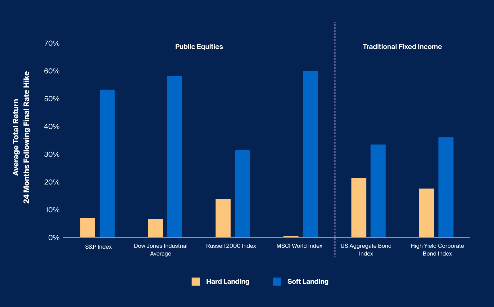
The chart below depicts the performance of public equity and fixed income during past hard and soft landings that followed a monetary tightening period. We measured performance as the average total return during the 24 months following a monetary tightening period.15
Hard landing scenarios are characterized by a tightening that resulted in a recession, while soft landings are economic slowdowns that follow tightening periods without resulting in recessions. If a recession had occurred either during a period of monetary tightening or in the 12 months following, we characterized this result as a hard landing, and the alternative—no recession—as a soft landing. In all, there were six monetary tightening periods between 1977 and 2021 that resulted in a hard landing and two that resulted in a soft landing. The bars represent the average performance of each index across both scenarios.

Footnotes
Source: Bloomberg, S&P 500 represented by SPX Index, MSCI represented by MXWO Index, Russell 2000 Index represented by RTY Index, Dow Jones represented by INDU Index, US Aggregate Bond represented by LBUSTRUU Index, US Corporate Bond represented by LUACTRUU Index, performance represents the average total return 24 months following a tightening monetary period, periods provided by the Journal of Economic Perspectives, hard landing represents a monetary tightening period that resulted in recession either during or in the 12 months following, soft landing represents a monetary tightening period that did not result in a recession during or in the 12 months following.
Source: Bloomberg, S&P 500 represented by SPX Index, MSCI represented by MXWO Index, Russell 2000 Index represented by RTY Index, Dow Jones represented by INDU Index, US Aggregate Bond represented by LBUSTRUU Index, US Corporate Bond represented by LUACTRUU Index, performance represents the average total return 24 months following a tightening monetary period, periods provided by the Journal of Economic Perspectives, hard landing represents a monetary tightening period that resulted in recession either during or in the 12 months following, soft landing represents a monetary tightening period that did not result in a recession during or in the 12 months following.
Performance varied for each asset class depending on whether the US economy had a hard or soft landing, most notably for public equity indices. Take the S&P 500, for example. In hard-landing scenarios, it averaged a cumulative 7.2% return in the two years following final rate hikes, compared to returning 53.7% in soft-landing scenarios (Exhibit 4). The best-performing asset classes were also very different for each scenario. In soft landings, large cap US stocks led the pack; in hard landings, fixed-income indexes outperformed.
The wide dispersion of historical performance outcomes across and within asset classes and between hard and soft landings may give advisors pause as to how to appropriately position portfolios. In this challenging environment, advisors may consider proactively revisiting existing asset allocations and portfolio exposures and expanding their portfolio construction toolset beyond what may have been effective in the low-rate, low-volatility environment of the decade prior.
Given continued uncertainty, a fifth of investors surveyed by Mercer globally last year said they have looked to make an allocation to illiquid assets “to reduce portfolio risk or for downside mitigation” while 76% said they have done so “to diversify portfolio exposure.”16 A larger majority (86%) of those respondents said they look to illiquid assets “in search of better yields or enhanced investment returns.” Illiquid alternative strategies may offer this kind of diversification by accessing areas of growth beyond the public markets. Advisors may also consider structured notes. Though they come with complex risks, structured notes may allow advisors to build exposures that complement existing allocations or align with their market views.


